Serverless Telegram Bot with Firebase

Using (free) Firebase Cloud Functions to start your first telegram bot, as always with Javascript.

1. Create your bot

Easy and fast:

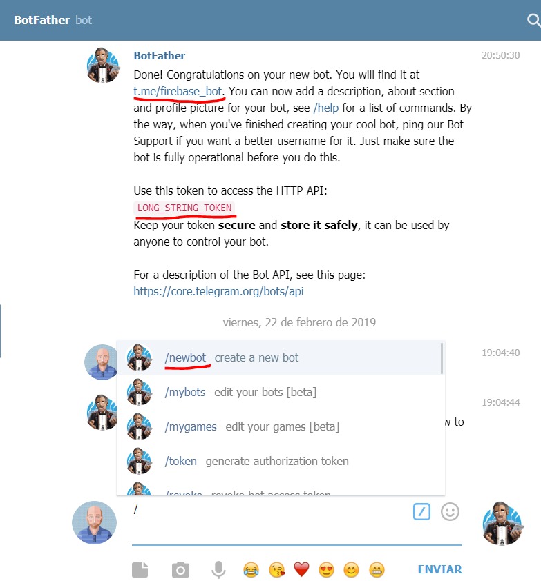
  1. Search in telegram @BotFather or open this link
  2. Write the command “/newBot
  3. Follow all the steps
  4. Write down 2 things :
    1. bot name (finished in ‘bot’): In our example firebase_bot
    2. Secret Token (don’t miss it): in our example LONG_STRING_TOKEN
Telegram bot creation

2. Create your firebase project

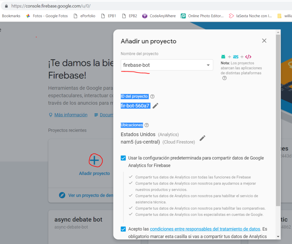
Go to your firebase admin page

  1. Go to your firebase console https://console.firebase.google.com
  2. Add a new project
  3. Write down the final id of the project: in our example firebase-bot-560a7
Firebase project creation

3. The code

I am going to assume you have Node and NPM installed in your system and you know how to use it

3.1 Set the enviroment

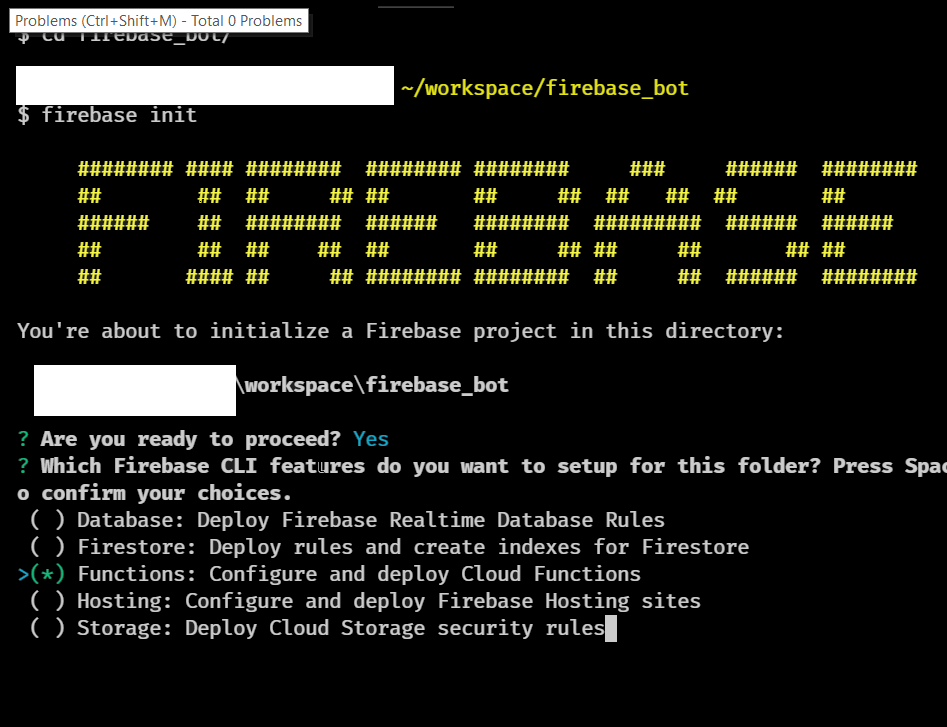
  1. Install globally firebase-tools: npm install -g firebase-tools
  2. Login into firebase: firebase login
  3. Create a folder and run: npm init inside
  4. Init firebase in the same folder: firebase init
  5. Choose: Functions: Configure and deploy Cloud Functions
  6. Select a default Firebase project:
    1. We have a firebase project id created on the point 2.3, if this is shown in the options choose it
    2. If the project is not there choose [create a new project] (we will pick the project later)
  7. Javascript or Typescript: (IMHO) Typescript
  8. TSLint: Yes
  9. install npm dependencies: Yes
  10. If in the point 6 you didn’t choose your firebase project set it now with: firebase use firebase-bot-560a7 (this has to be the id of your firebase project, point 2.3)
  11. install functions dependencies:
    • cd functions folder
    • npm install –save express cors

3.2 The actual code

Our bot will reply to any telegram message with a “Hello message-user-first-name”

We are going to create a router function in order to be the single entry point for all telegram messages.

[codepen_embed height=”798″ theme_id=”0″ slug_hash=”ErqQLG” default_tab=”js” user=”pikilon”]See the Pen Simple Firebase Cloud Telegram Bot by Pikilon (@pikilon) on CodePen.[/codepen_embed]

3.3 Deploy your code

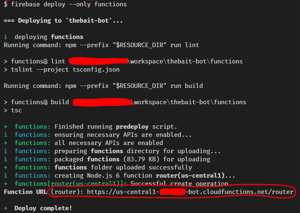
Now that you have create your bot code you need to upload it to firebase to be compiled and available

  1. In the root of your project run: firebase deploy only –functions
  2. Wait until the process finish and write down the router function url: in our case https://us-central1-firebase-bot.cloudfunctions.net/router

4. Bind the bot to Firebase

Now you have the bot, you have your firebase cloud function running, you only need to connect them.

  1. Go to your browser and put the bold text with your data, we have defined TOKEN in 1.4.2) and the url in 3.3.2 MAIN LAST “/”
    • https://api.telegram.org/botLONG_STRING_TOKEN/setWebhook?url=https://us-central1-firebase-bot.cloudfunctions.net/router/
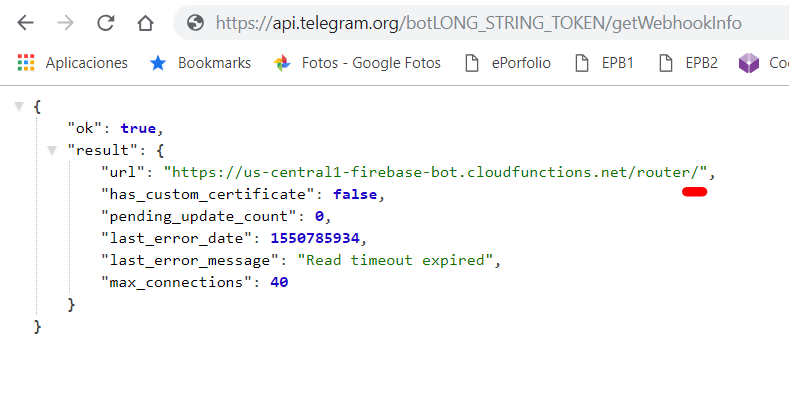
  2. Check is set correctly going to https://api.telegram.org/botLONG_STRING_TOKEN/getWebhookInfo
Telegram bot and firebase binded

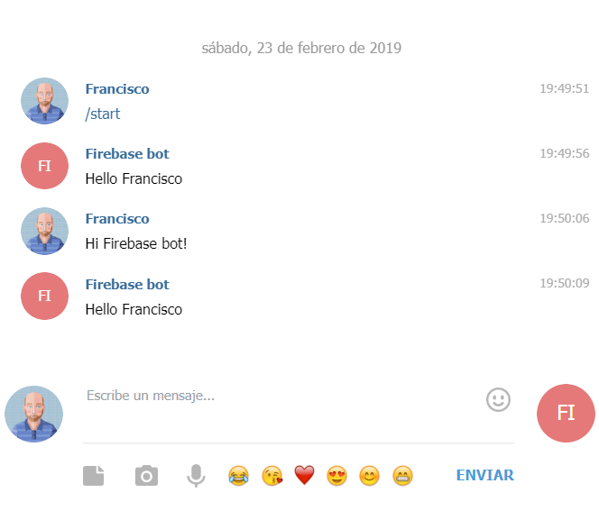
5. Check the results

Let see it in action!
Open your bot in telegram and say hello to your creation

Voilá

Browser wars II: The iOS betrayal

React Native or Flutter are here to help you to create easily your App in iOS or Android (even web), using the same code and with an awesome performance. But there is only a little thing…

The Golden years

Before the smartphones, after the reign of desktop applications we met the golden years of Web apps, web 2.0 was rising, and we found the UI koiné : HTML5 .

If you wanted to develop an App for Windows, Linux, Mac and the first iPhone you wrote the interface in HTML and that works everywhere, HTML5 stole Java’s slogan: “Write once, run anywhere

The only thing you need to develop an entire app was literally a plain text editor

We left behind the hard part of the first browser war, yes, we had Internet Explorer 8 giving troubles, but jQuery helped a lot.
Browser fought for being the more standard compliant, they fought to add richer experiences, and, as always, they fought to be the fastest one.

In every device with a browser you had your app running, almos everywhere until…If you had a thing with a browser you browse your app there, and then…

The iOS betrayal

There was no app store on the original iPhone, It was meant to use HTML5 apps.

The web was perfect, this was the excuse to not have support for Adobe Flash, fighting for the standards they say.

When the App store came Apple realized it was a gold mine, they could have a cut of any app working on the iPhone through the only available app source: their store.

Suddenly the good old HTML5 became an enemy to destroy, why support web apps with no Store fee? Let’s begin the boicot:

  • No webWorkers until yesterday, and now very cripple one with limitations such as no push notifications, you can’t add the app to the list with a link, no touch id, no more than 50Mb, etc.
  • Forget a workaround using third party browsers, they are forced to use the iOS engine with this limitations.
  • For develop any app in iOS you will need an Apple device, just like that. You can emulate Android on Mac, but you can emulate iOS outside a Mac. You will need Xcode one way or the other.

Regulations do their part to damage web app UX. Ignorants Politicians forced every web site to put a cookie banner, instead of encourage private browser’s mode.

The false saviors

Oh gods! I wish to have something to code onces and deploy everywhere, web, iOS, Android, even desktop, with performance. Yes, the performance is the most important thing in your app, even if is a regular shop and your users will not notice the difference.

React Native

Using Javascript and React you will be able to deploy literally everywhere and with a theoretical performance 80% compared to native.

But to be honest this is a lie. You will make you choose between having a bad app on 3 platforms or spend 3x more time to have consistency between them. Two graphic examples to show that even the browser wars was a child game compared to the inconsistencies:

  • Styling
    • Overflow-visible you can position text outside a box in iOS and web, but not in android.
    • You will be forced to use css-in-js that generate crappy css files for the web. I will talk (badly) about css-in-js in the future
  • SVG (multicolor): iOS doesn’t support it, android and web does, you will have to install a plugin and face consistences.

You can read more reasons why is not a solution from former react native fan AirBnB here.React Native: using Javascript and React you will be able to deploy literally everywhere

Flutter

Google has money, React is from Facebook, let’s try to beat the React Native hype.

With Flutter you will code on Dart (wikipedia link here) and it will paint in a screen canvas your interface (less inconsistencies) and with great performance, they swear to get +15ms in rendering your kittens.

  • Who wants to learn Dart, manage yaml packages and flutter custom styling? Tell your devs to start learning Dart to master it only for Flutter, or even worst tell a rookie to start with Dart language. Let’s everyone to learn esperanto, it will be fun!
  • No web currently, create another app in HTML5 or wait to the experimental becomes alpha.

The silver bullet

XKCD nailed again

We want to have an App written with the same code, runs everywhere with UX consistency, with experience and support…what about HTML5? and you will only need a notepad and a browser to develop it.

If you (really) need performance to do some operations, first review your code and if this is not enough check out webassembly that offers up to 80% of native performance to make some heavy lifting. But really, check your code first.

If you need something like push notifications in your app, start small, give support to the good guys that don’t cripple the web: Android and Desktop. If your app has huge success and you need iOS support use a web wrapper like Cordova. I wish you luck to deal with Apple bureaucracy to publish your app.

And one last thing, web is open source, lots of developers has learned by right clicking the browser and inspecting the code. It was like open a hood of a car to see what was going on there. “How did this dev this that?”, “look he added this workaround to achive this effect”…

you can’t right click a native App

Rem + em, a love story

Not this REM but…

With the new times using javascript for everything on the frontend (React.js, Angular.js) CSS is targeting more and more modular coding.

This is why if you are progressing in CSS you should learn BEM naming conventions.

A common problem I found is the designer use REM units for everything (or even worst PX) because they fear if you use relative units it will be affected by the context, and they want the css rules to be as standalaone as they could. There is a mayor problem with this approach because if you create different sizes of the same component, or you want to change the layout you have to rewrite all the sized attributes. This means more code, more complexity, hard readability…

The solution is to use REM units in the parent and use EM in everychildren, so when you make only a big mediaquery in the body and it will adapt itself all the way down in the body.

Check out this example code I made in codepen.

[codepen_embed height=”265″ theme_id=”0″ slug_hash=”KqXbWr” default_tab=”css,result” user=”pikilon”]See the Pen <a href=’https://codepen.io/pikilon/pen/KqXbWr/’>CSS relative units in component layouting</a> by Pikilon (<a href=’https://codepen.io/pikilon’>@pikilon</a>) on <a href=’https://codepen.io’>CodePen</a>.[/codepen_embed]


Better bootstrap grid

Bootstrap is a great framework (if is in the right hands) and the grid system is one os the most used tools, but isn’t is very repetitive to write?

If your answer is yes you’ll like this unobtrusive bootstrap addon I made. Make grid faster, without writing “col-md-2” six times (in each column).

I add two more things: no-gap columns and a 10 columns based grid (using col10-*-* and .row.base10-*-*)

And you can see documentation and download the file in my github here
You have an example here

[codepen_embed height=”265″ theme_id=”dark” slug_hash=”vKBgJp” default_tab=”result” user=”pikilon”]See the Pen <a href=’https://codepen.io/pikilon/pen/vKBgJp/’>Bootstrap addon better grid (add it before the bootstrap library)</a> by Pikilon (<a href=’http://codepen.io/pikilon’>@pikilon</a>) on <a href=’http://codepen.io’>CodePen</a>.[/codepen_embed]

No more modals

Lightboxes, a modal windows, whatever… someone has to stop this.

Like the slider is something that is requested for almost any user interaction

Phones don’t respond well to them

Yeah this is a modal on my phone

You could end up cropping the window, making impossible to zoom in/out, or worst, the user hit “back” and it could leaving your site.

If you have an image use “open in a new window” link, saves time, css/js and the results are better.

link_new_window
Same page, same image but showing the jpg without modal.


Awful interfaces

I have seen 5 levels of modals, or generate one for things that can be solve with an “confirmation” prompt or even an alert.

More levels, more!

Try to use other UI like Tabs, slidedowns, when ever is possible it will be more friendly for the user. Very often the modal is a fast solution because we haven’t spent enough time thinking the right answer to the problem: where to put the form, where add some confirmation button, etc.

In conclusion: modals are the new 90’s Pop Up windows, are related with the annoying advertisement and should be use only if we need to shake the user and screen him “look here idiot, do what I told you”.


CodeAnyWhere, literally, anywhere

Codeanywhere Logo

This are the IDEs I’ve used

  • Dreamweaver: It was ok to start like 15 years ago.
  • Notepad++: the best back then, but no linux, so no thanks.
  • Sublime text: I can’t put “love it” enough times to express what I fell for it, despite the annoying messages to buy the app or the plugins.
  • Brackets: very cool, cool enough to envolve Adobe, and more important, open source. No enough plugins to win to sublime.

But Codeanywhere is like the “One Ring” for web developers: A web developed IDE to rule them all. This very site it’s been developed on it!

Main features:

  • Any Browser, any devices: Your computer broke, you can go to another computer and continue working where your was, doesn’t matter if is linux, mac or Windows. No computer near? you can use it on tablet or smartphone (even use chromecast to see it on the TV) it has apps for iOs and Android.
  • Free version: Only 1 FTP and 1 virtual machines is more than enough to see if you are comfort with it. I already switched to pay version.
  • Virtual machines (containers): You can generate your own ones preconfigured and start developing in seconds, nothing of command lines on linux, nothing of missing libraries, updates or so. You have ubuntu/centos machines with lot of setups: Laravel, Php7, wordpress, Symphony, node.js, Mean, ember, meteor, backbone, swift…
    • You can connect to this virtual machines with a web SSH client
  • Multiple storage clients: FTP, SFTP, Dropbox, Git, Google drive, Amazon S3 you name it.
  • Friendly editor: It’s clearly inspired by the best: Sublime Text, it has emmet preinstaled, you have shortcuts (configurable) , multiline selection, regular expresions search/replace, multiple code linting, html/css beautyfier.


[lazy_responsive_img ids=”172″]
Yeah, they already have PHP7!

If some codeanywhere developer is reading this here it is some improvements to make:

  • History in tab switching: so you can alternate between 2 tabs by pressing a single keyboard shortcut.
  • Php beautifier: and other languages.
  • Sass css: Classes highlight is in a grey hard to read, I have to switch to CSS in order to beautify the code, which works nice.
  • Html: closing tag underlining when open one is selected, so you don’t have to collapse the tag.
  • Mouse multiline selection (like sublime with right button).
  • Code snippets and macros creation
  • Docblock support with the snippet “/**”
  • Better Emmet on CSS, so you can write “tt”+TAB and is processed to “text-transform: “


Firefox and WebP

Webp Logo

This image is using a .webp file instead of using a .png, it has transparency, it has lossless quality and only weights the 60% of the same PNG. Half size = double speed.

It also supports lossy compression (like a JPG) so, if you need transparency without the huge size of a PNG, which is a big deal. The Web developers were very happy in 2010 when google released this open standard.

It’s been 60 internet years and Mozilla still refuses to implement it in their browser, in a first moment they say they will come with a better jpeg format. Where is it? no one knows.
We can understand this way of doing things from Microsoft, or Apple (because they want a proprietary  standard to make some bucks) but from Mozilla is a shame. More even they join this companies supporting .h264 video format.

So, when someone ask me which browser is the best I’ll go with chromium, for this and other reasons.

Ah, in the case you are in Firefox and you are seeing the image is because I added an HTML5 fallback with the two images (PNG/Webp).  Don’t fool yourself, it works but is far to be a solution, you are still downloading a big PNG and I had to upload 2 images.

Implement Lazy Responsive images in your wordpress

Webpages are read from top to bottom, and by bottom I mean the end of the whole content, even the one you are never going to see.

Video is the most bandwidth consumer in internet, but if you are in your phone, the browser will protect you avoiding video “autoplay”, but no with the images. So, sometimes, the browser will save your data plan avoiding play a 200 Kb background video, but it will be ok if the proud guy with the portfolio decided to put 30 Mb of images on a single page.

But because surely a lot of readers don’t give a damn about clients data plans I’ll say the magic words: Save bandwidth is very good for SEO. Less Mb = more speed loading = better ranking. Google knows that regular user is impatient and will hit “back” on a search result if takes long to load.

What is a lazy image? An image that will not download any data until is visible in the screen. Usually it’ll start to load when is closer to be seen, avoiding the wait to show up. So if you fill the site with hundreds of images it won’t matter until you scroll down. The browser doesn’t do it by itself so we’ll need a javascript solution.

We are saving a lot of data here, but it is not enough.

Very often you see a really big image in a very small screen. Imagine an slider with 5 images of 1200×700 px, and you are seen them in portrait mode in a 720×1280 screen, so in the end, you’ll  see five 720×420 images with 4 times more (surface) weight they should have.


[lazy_responsive_img ids=”144″]

EG: 600×600 images shown as 150×150, and some PNGs!

What is a responsive image? An image with a set of source files that will load the closer to the size is been seen. It is included in HTML5 and it can be coded in two ways, adding a “srcset” attribute to an <img> tab or use the HTML5 “picture” tag with different sources.  I am not going to repeat the great article from Smashing magazine with all the info you are gonna need.

It has one big annoying issue, you have to calculate (using media queries) which file to serve using mediaqueries, a good pain in the ass.

Shouldn’t be great have one solution to have lazy images and auto-responsive-images?  meet lazysizes

This great plugin allows you to release this feature today (take care, not IE8 supported).

So you want to use this on your WordPress theme, you don’t find the right plugin, and you want to learn how to do it, here you have what came with, put it on your functions.php o create a plugin, hope you like it!

[gist id=”e6f8a1f1397efa9019de”]